These four options are available in the Options panel and are duplicated in the Character panel. It doesn't matter which panel you change these options in, the values will be duplicated:
Anti-aliasing method for letters
Anti-aliasing is a technology used to improve the visualization of text letters in order to smooth out hard edges and remove “jags” that appear on the edges of letters.
This option is also duplicated in two panels:

On at the moment in Photoshop there are seven methods for smoothing text, including the “no anti-aliasing” (none) mode; in the figure I have shown the Russian and English Photoshop interfaces:

Each of the anti-aliasing methods produces its own effect on letters, and for each individual case the method must be selected experimentally, but this is ideal, but in practice I mainly use the anti-aliasing method set by default in Photoshop - “Sharp”.
In the figure I gave an example of two types of Photoshop text smoothing:

Line spacing (leading)
This text parameter is only available from the Character panel; as the name suggests, it sets the vertical distance between lines. By default, the parameter is set to "Auto":

Basically, the use Line spacing set to Auto gives good results, but you can set Line spacing independently before entering text, or after entering, selecting all the text. You can choose one of the preset values (from 6 pt to 72 pt), or enter your own using one of Photoshop’s methods for entering parameters, i.e. change by dragging the mouse or scrolling the wheel or entering a value into the window from the keyboard.

Tracking (Letter spacing, Tracking)
Parameter "Tracking" Also only accessible from the Character panel, it controls the spacing between letters or symbols. It is located directly below Line spacing and by default set to 0:

To set the value letter spacing, you can click on the triangle to the right of the input field and select from a list of preset values, you can enter a value from the keyboard, or change the parameter by dragging the cursor or rotating the mouse wheel. Entered negative value Tracking will move letters or symbols closer together, while a positive value will move them further away from each other.
To change Tracking, select the desired section of text and enter the value in the input field. In the example, I increased the tracking in the word “section” without affecting the rest of the text:

Kerning
This option is also only available from the Character panel and is located to the left of Tracking. By default it is set to Metrics, what this means I will explain a little below. Kerning adjusts the spacing between two specific letters or symbols:

Kerning often confused with Tracking because they seem similar, but they are actually completely different things. While Tracking sets the range between all characters, Kerning adjusts the distance between two specific characters. An analogy can be made if Tracking- global setting, then Kerning- "local".
In order for the option to become available, you must place the cursor in the text between the two desired letters. In the example I set a negative value Kerning:

As I already said, the default option is Kerning is set to "Metric", which means Photoshop uses the letter spacing specified by the font design. This option often gives better results in most cases, although it depends on the properties of the font used. If you click on the small triangle to the right of the value entry field Kerning, you will see that directly below the Metric value is the Optical value. With this option, Photoshop automatically sets letter spacing based on the shape of the letters. Again, it depends on the font itself which of these two options, “Metric” or “Optical”, will give the best result.
Change value Kerning You can, as in other options, from the keyboard or mouse.
Vertical and Horizontal Scale
These two options are located directly below Kerning And Tracking.
Their purpose is clear from the name; the options scale the selected text vertically or horizontally.
Both of these options are set to 100% by default

Baseline Shift
Below is the option Baseline offset. Base shift allows you to move selected sections of text or individual letters above or below the font baseline. By default, the option value is set to 0 pt. Positive values will move the selected text above the baseline, and negative values will move the selected text below the baseline. The option does not have preset values, so the value must be entered manually:

Additional text options
Below are buttons for additional options.
From left to right: pseudo-bold, pseudo-oblique, all caps, small caps (reduced capitals), superindex, subindex, underlined, strikethrough. Using an example, I showed the effect of options in the text starting from the second line:

Language selection
In the lower left corner there is the “Language Selection” option, designed to check spelling and hyphenation, but at the moment, for Russian, and indeed for English, it is ineffective, so the option is not used.
In CSS, setting line spacing is very easy. There is a special property for this. But, of course, there are many other parameters that are universal and can be applied to text.
If no settings are made, the default values are set. You can change this distance if you wish. The value can be either a percentage or pixels.
Row height
In CSS, the distance between lines can be demonstrated by the following image.
The image above shows the parameters with the corresponding distances. The text is located in the font-size space. Please note that the line of text does not start at the base, but slightly above. The space below is provided for letters that have elements below (g, y, and so on).
Note that the space between the font-size blocks is called leading. In HTML and CSS this property does not appear in any way, but it is in other graphic and text editors. For example, in Adobe Photoshop.

The figure above shows where you can specify leading in Photoshop. And next to it is the font-size parameter.

Examples of using line-height
In CSS, the distance between lines can be set as a percentage. An illustrative example is given below.

If the value is small, it will be inconvenient for the user of your site to read.
The distance can also be changed by the font size. If the difference between the main parameters is very different in numbers, then this difference is compensated by increasing the leading.
Subtleties of design
In CSS, the spacing between lines can be further adjusted with various paddings. Let's look at the example in the figure.

In our case, the “Element” field will contain text. Padding is the padding inside an object, and margin is the padding behind the object. Border is a frame. It could be 0 pixels, or it could be 100.
The following image shows all the padding, border, and line height of the text at once.

If your text is small, just one line, or each line is in a separate paragraph, then the distance can be adjusted by indenting between these paragraphs. That is, maring and padding between lines in one element have no effect. They create indentation only along the edges of the object. The object is the entire paragraph, not the lines within it. It is important not to get confused here.
In cases where there are many lines, and all of this is located in one object, it is recommended to change the font with the main parameters.
How to increase spacing between CSS lines
The spacing between HTML lines can be specified for any class or for all paragraphs in the text. If you specify it like this: p ( line-height:20px; ), then absolutely all paragraphs on the page will have lines of 20 pixels. If necessary in different places different sizes, it is recommended to do as follows.
We write styles.
Class1 ( line-height:20px; )
Class2 ( line-height:16px; )
Class3 ( line-height:12px; )
For clarity, let's add a frame so you can see that it works. In the future it needs to be removed.

Please note that in the third case the stripe ran over the text. This is because it is greater than the line height. Therefore, it is important to ensure that there are no such contradictions. If you make a small line height, then reduce the font accordingly.
It is not recommended to make text too small and the space between lines too small. Because no user can calmly read all of this. His eyes will quickly get tired. Search engines They also say that the text should be user-friendly.
Moreover, recently there has been a great emphasis on convenience for mobile users. There, the recommendations always say that the font size should be normal, not small. This especially affects links. With their small size, it will be difficult for the user to navigate the site.
The Google search engine has a special tool that helps with this analysis. It is very convenient for webmasters.
Here's an example of the results that might occur.

- In the palette Layers(Layers) Select the text layer.
- By desire. Using a tool Toure highlight the piece of text that needs to be changed. Otherwise, tracking will be applied to the entire text.
- Click the button Palettes(Palettes) to open the palette Character(Font) if it is not already open.
- Select one of the tracking values from the pop-up menu Tracking(Tracking) or enter any of your own values (Fig. 17.19). Use a negative value to bring characters closer together, and a positive value to increase the space between them.
Rice. 17.19. Increased character spacing in header
 Pressing a key Alt with active instrument Move(Move) and pressing the left/right arrow keys can copy the entire text block.
To ensure that online text is readable, characters should not be placed too close to each other.
Setting line spacing for horizontal text
Line spacing (leading) is the distance between the current line of text and the line located above it. Each character can have its own line spacing; the largest value will determine the line spacing for a given line.
By default, line spacing is calculated in proportion to the point size. Their relationship is indicated in the dialog box Justification(Align), which is opened using the palette menu Paragraph(Paragraph). By default, the spacing is 120% of the point size. For example, the default line spacing for a 30-point font is 36.
To set the intercharacter distance in text that is located vertically, select the desired characters and change the tracking value in the palette Character(Font). You will see that the text will change after this.
Therefore, if you set different line spacing values for the lines of a paragraph and then edit the text, changing its distribution across lines, the line spacing may change.
It's impossible to say with certainty that the text you create will be remarkable in every way, but using optimal distances between the lines will make it much easier to read, even if it takes up a lot of space on the page. Don't bore the reader before he reads all your clever thoughts.
What was said above about text formatting applies only to Photoshop. If you use other applications, the procedure for selecting a font may be different. When creating texts for the Internet, it is better to turn to a program designed for Web design.
- In the palette Layers(Layers) Select the desired layer.
- Optional. Select one or more lines in which you will change the line spacing. If the text was entered line by line, then you need to select the entire line. If you do not select lines, the changes will occur throughout the text.
- Select or enter a line spacing value in the palette Character(Font) - see fig. 17.20, 17.21.

Rice. 17.20. Selecting line spacing

Rice. 17.21. Paragraphs with the same point size, but different line spacing
Offset of selected characters relative to the baseline
- On the palette Layers(Layers) Select the desired layer.
- Optional. WITH using the tool Toure(Text) Select the characters you want to shift. Otherwise, all layer symbols will change position.
- Open the palette Character(Font).
- Enter a value in the offset relative to the baseline field (Fig. 17.22) - positive if you want the letters to be located above the baseline; and negative - otherwise (Fig. 17.23). If you did not complete step 2, press Enter.

Rice. 17.22. Offset field relative to baseline

Rice. 17.23. Position of text when entering positive, zero, and negative offset values relative to baseline
In both types of text: Dotted and Paragraph text, it is possible to set line spacing (vertical spacing between baselines). Enter a numeric value in the window for this option, or use the “Auto” key to automatically configure.
5. Paragraph Options settings.
Basics of Alignment.
Since the Paragraph text layer can contain several lines, its formatting is very important for the quality of the design. Let's open this function by going to the Window-Paragraph tab (Window > Paragraph). Create a Paragraph Text layer by writing something, apply an edit (click the checkmark for the conclusion at the top of the panel) and activate the text layer by clicking on the layer thumbnail in the Layers panel. Then go to the “Paragraph” tab and set the settings you need for the arrangement of lines of text by pressing one of the keys. Alternative: Select your text, or part of it, using the Text tool (Type Tool) and apply the setting option in the Paragraph window only to the selected lines of that test layer.
Of course, the main function of the Paragraph option is text alignment. You can easily customize this feature: align left, center, right, or fully align (Left, Center, Right or Justify) by clicking at the top of the “Paragraph” window. In addition, there are three options for justification, changing the alignment of the last line of text, or selected text (right, center, left).
To adjust word or letter spacing, in the “Paragraph” window, click on the arrow on the right and select the “Spacing” option in the drop-down menu (Justification). Enter settings for word and letter spacing, glyph scale, and line spacing settings.

Transfer (Hyphenation).
The settings you select for hyphens affect the horizontal spacing of the paragraph, making it wider or narrower depending on the words on each line. To use wrapping for the Paragraph text layer, select a language in the window settings, and activate the wrapping checkbox in the Paragraph window. To disable this feature, clear the checkbox.
Most of the time, automatic hyphenation does a great job with text, but sometimes you need some customization. To activate additional hyphenation functions, click the arrow on the right in the “Paragraph” window and select “Hyphenation” from the drop-down menu, and you will see the following:
In words, longer than #letters (Words Longer Than #Letters): If you set the numeric value to 5 in the word "PHOTO", then there will be no hyphen. If you set the number to 3, then this word will look like “PHO-TO”. The default value is 2.
After the first # letters and before the last # letters (After First #Letters and Before Last #Letters): Defines the minimum number of characters at the beginning or end of a word that can be broken by a hyphen, i.e. if you set the value to 1, then in the word “Hello” you will get a hyphen like “H-ello”, in the word “action” you will get “action-n”. The default option setting is 2.
Transfer limit (Hyphen Limit): Sets the maximum number of consecutive lines that can be transferred.
Transfer zones (Hyphenation Zone) Set the distance from the right edge of the paragraph.
Hyphenations in words with capital letters (Hyphenate Capitalized Words): Prevents hyphenation in words with capital letters.
Indentation and spacing between paragraphs (Indent and Space Between Paragraphs).
Making indents is quite simple. To do this, activate the text layer or select the text and enter settings for indentation on the right or left side. You can also indent only the first line of a paragraph, as in example 2 below.
In addition, you can easily add space between paragraphs (before or after) in the Paragraph window using custom settings in the windows Space Before/Space After.
Warp Text.
One of the most powerful features of the Text tool is (Type Tool) is the ability to deform any text layer to suit your needs. To deform a text layer, double-click on the layer thumbnail and click on the right side top panel settings icon with a curved letter “T”.
After clicking, a dialog box will appear in which you must select the style for changing the text (vertical or horizontal). Below there are three sliders for increasing/decreasing bending, horizontal and vertical deformation. Below is an example of deforming Dotted text using the Arc style with different settings this style.
Of course, you can warp the Paragraph text layer with the same Arc style, imitating the effect of the text in the Star Wars movie by vertically distorting and applying a Gradient on the mask of this layer.

Try different variants of text distortion, which is quite interesting. However, there are restrictions for texts written in bold and pseudo-italic fonts.

Creating text along a path (Type on a Path).
You can create a text layer that will follow the path you made with the Pen tool (Pen Tool) or the Free Shape tool (Shape Tool) in outline mode. First make the contour line you want, then activate the Type tool and place the cursor anywhere on the path. You will see that the cursor shape has changed to an S-shape. Now click on the outline and start typing.

Creating a path on a shape (Path on a Shape).
The process of adding a text layer to a vector shape is the same. Create a shape, then use the “Outline Selection” tool (black arrow) to activate the outline and, selecting the “Text” tool, click on the outline of the shape. After changing the cursor type, we write the text. You can edit any option character, such as increasing the baseline to create space between the shape and the text.

Editing text on a path (Edit Type on a Path).
Sometimes you need to change the orientation of text or its position on a path. To do this, activate the Path Selection tool. (Path Selection Tool), place the cursor on the text. You will notice that there is now a small black arrow pointing away from the cursor. Click the text and place it on the other side of the outline. The placement of text inside a vector form occurs in a similar way. You can add a layer style to this text and edit it as you wish.
Convert Type into Shape.
Sometimes we need to change the shape of characters for purposes such as logo design. Photoshop does a great job with this. Create a text layer or select one of the already created ones, and go to the Layers - Text - Convert to Shape tab (Layer > Type > Convert to Shape). This function converts text into a vector mask layer that can be edited in the same way as other types of vector shapes. You can create a work path from text by going to Layers - Text - Convert to Work Path (Layer > Type > Convert Work Path).

Type Mask Tool.
Finally, you can do most of your work with the Type tool, using text selections instead of text shapes. To do this, click and hold the mouse button on the “Text” tool icon, then select Horizontal text mask or vertical one. When you select this tool, you can quickly create a selection of a shape, which is convenient for use on any layer mask or in Quick Mask mode. Below is an example of creating a word using the text mask tool. I used a selection to create a layer mask on the image.

6. Conclusion.
The Type tool is powerful in Photoshop. Once you practice with symbols and paragraphs, you will become a true master. There are no limits to creating masterpieces with the Type tool.
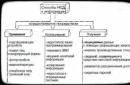
The Microsoft office suite is widely used, and its DOC format has practically become the standard for formatting text documents. Unfortunately, most users end up with this word processor learning how to change the font typeface and mastering its alignment on the page.
Meanwhile, many organizations have rules for working with text documents, which prescribe certain parameters their design. They usually define the type font, used by default and the required line spacing in the document.
Change intercharacter distance, also called kerning, is required mainly to give the formatted text a more harmonious and aesthetically complete look. Its main area of application is typography, or artistic layout.
How to change and adjust line spacing
There are several ways to change line spacing in Word. ways:
The last item is called up by clicking right mouse button and allows you to manually adjust line spacing in a wide range of values.
Line spacing values
Line spacing is distance between hypothetical lines passing through the middle of letters in lines and is equal to the default font size. Standard sizes, available in Word, are 1, 1.15, 1.5, 2 and 3 values of this distance. 
Drop-down list, in the item " Paragraph", allows you to use line spacing options in the text that differ from those indicated. In addition to the standard set of single, one and a half and double, you can also find the following here:
Changing the letter spacing
Each character, in any font, is allocated a certain space, but, depending on the style, the letters can fill it in different ways. To accurately adjust the space they occupy, they use kerning. In Word, it can be specified in three different options. In addition to standard, available sparse And compacted.
Adjustment is carried out in increments of 0.1 points. This parameter can be accessed in two ways:

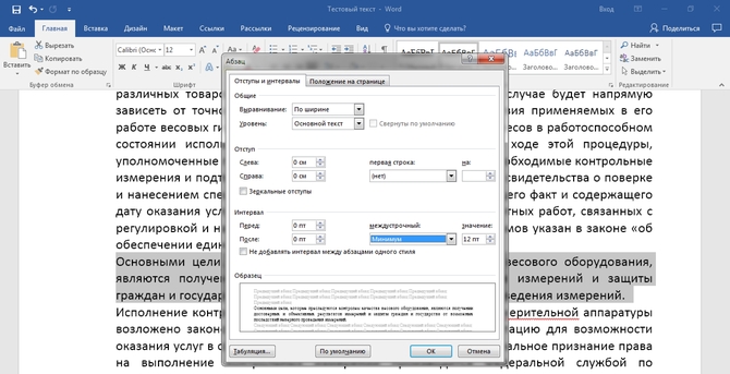
To give the text an aesthetically complete look, sometimes it is necessary to apply visual separation between paragraphs. Keystroke Enter, which is normally used for this operation, does not have this effect, since it simply moves the cursor to the next line. Login edit menu can be done in two ways: 
- Using context menu « Paragraph» called by pressing the right mouse button;
- Using the command group " Paragraph" on the " tab Home» Word.
In both cases it opens additional window, in which using the sector " Interval» you can set the indentation before And after paragraph. The adjustment, regardless of the selected font typeface, is performed in a fixed increment of 6 points.